2014
2014
2020
PROJECTS
Slipehuset
We worked with the company Knivservice as part of a university commercialisation project, which involved a full rebranding, new packaging and strategy created for the company.
A Brand Manual was handed to them with all the do’s and don't s regarding the placement and use of their logo. Their website was re-designed, together with all their merchandise.
group project in collaboration with Polle Van Duuren, Marius Haaverstad, Øystein Askeland
2015

Slipehuset stationery and app rebranding
Technical skills
- logo design
- branding
- UX/UI
- web design
- user interaction
- presentation
soft skills
- team work
- client work
new name / new logo
Originally Knivservice (knife service), we proposed a new name: Slipehuset (the sharpening house) giving it a more traditional/homey feel.
The sharp edges of the logo remind of the sharpness of a blade and give dynamicity, whilst the shape reminds the user of a house.
Both logo and new name were adopted by the company.


top to bottom: previous and new logo


fonts / colour choice
For the text we chose a modern/sharp typeface joined with a serif type, to have a more traditional and a ‘blunt’ feel.
The colours aim to give a clean and calm feel to the customers. A study on the effect of color on people was made, together with many iterations until we reached the final palette.
identity / stationery
Once basics were established a brand identity throughout the products of the company was applied. Invoice and subscription letters, business cards, envelopes and memorabilia (such as a notebook) were developed.


Envelopes and invoices, matched to their corresponding envelope colour


Business cards examples

web design
A scroll-down website design was made. Giving a flowing easy feel, with information about the services offered, easy contact options and info on existing customers.
Access to your own account and live feed on company was also added, for more ownership from the users.

SMS BOT
A new service around an SMS messaging bot was designed. Allowing customers to reach out more easily and giving the possibility to the business to send service reminders after a set time.
We worked on the architecture and flow, to ensure the best user experience.

left to right: example of the mobile bot response, flowchart for the bot response
clusters
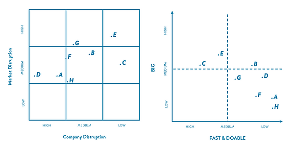
Analysis of the current business situation and formulation of new innovation possibilities was made: internal analysis, external analysis, SWOT & clustering were used.
We identified the business and service innovation possibilities through a SWOT analysis. We established 8 main innovation directions, using matrices to evaluate the clusters. They were rated on corporate vs. market disruption and on impact vs. ‘do-ability’.
In the graph you can see a combination of our outcomes and how some clusters were combined to obtain two directions.


timelines
We did an in depth evaluation of innovation scenarios and possible future business strategy creation. Marketing probing, personas analysis, strategy assessment and scoring was used.
To understand what had to be included to create value for the customer in both approaches, elaborate timelines were made.
Different business themes like Open Innovation, Strategic Networking and Systems Design were taken into consideration and it allowed us to understand what the implications, obstacles and success factors would be.


strategies
We designed and developed a final Marketing Plan and balanced the consequences of each approach.
Finally we created the implementation method and formulated a commercialisation plan, based also on the Financial Projections based on estimations and available data.

packaging iterations
We studied the interaction when opening the package and how it could be improved, within the limitations of the postage system and considering the presence of delicate sharp objects in the package.
Ease of opening, security, brand identity and safety for scissors and users were key. We explored a series of shapes and closing methods for the outer shell, together with scissor holding techniques.
Laser cutting cardboard was used once we had SolidWorks/Illustrator models, to work faster.
exploration of scissor postage packaging
final packaging
Size: fits in a average mailbox, no need for special delivery.
Colours: takes on the same colours of the rebranding.
Logo: the logo is present for easy identification.
Security: the presence of a locking mechanisms on the sides plus a glue line, allows for the box to be used twice and still secure the scissors.
Scissors: 4 scissors fit and slide in, in alternating fashion.
Opening: like a book opens left showing a personal message about when the scissors were sharpened.

final prototype to send blunt scissors and receive sharpened ones