2014
2014
2020
PROJECTS
De'Longhi Interface
As part of my internship at De'Longhi, in Treviso (IT), I was tasked with designing the interface for one of their new ironing systems. Developing from first sketch to final prototype.
2014

3D model of the ironing system interface - made with Alias Autodesk
Technical skills
- 3D modelling Alias Autodesk
- colour theory
- sketching
- prototyping
soft skills
- collaboration
- presentation skills
brief definition
Definition of the area of the interface and of the placement of existing technology and interactions which the designs needs to take into consideration.


competitors
It was important to analyse other ironing systems but also the details from the interaction of competitors.
Models from Philips, Tefal and Rowenta were chosen to analyse and weigh the pros and cons of each one.
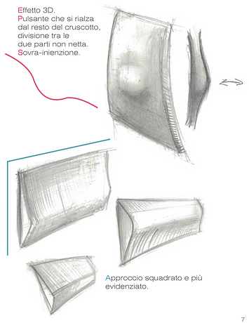
sketches - lever
Sketching was key to understand the best directions to take.
It was key to understand how to detach the iron in the easiest way. Four main shape directions where considered, as can be seen on the right drawing.
Curves and shapes to echo the rest of the ironing system were taken in the sketches of the interface.


sketches - buttons
It was important to consider the layout of the buttons, to match the electronics below, yet keeping a strong aesthetic and smooth user experience.

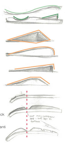

sketches - curves
A series of profiles were explored and the more smooth and rounded one was chosen for its sleek aesthetic, which would give it a more high end look.
The buttons were divided into a top section (block and on/off buttons), at the top curvature, and a bottom section (optimal steam and reset buttons) where the curve straightens.
references
To facilitate the 3D process, references of other buttons and interfaces with similar aesthetics, used in different contexts and environments were used.

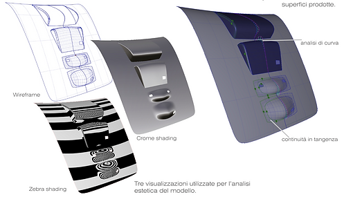

autodesk simulations
Having chosen the curved and sleek aesthetic it was of utmost importance that the curves were smooth and reflected light in a specific was, allowing also for smooth interaction.
Locators were used to understand quality of curvature and tangency.
The 3D model was also key in aligning the interface to the mechanics and electric components below.
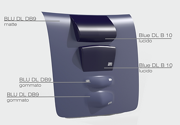
colour exploration
Sober tones, in the blues and greys were the preferred directions, to match the TOV desired. I created a moodboard and colour combinations linked to it.

colour choice
From the 4 main colour categories: tone on tone, focus on certain buttons, high contrast and monotone. A solution tone on tone with higher contrast on the higher key buttons was chosen.

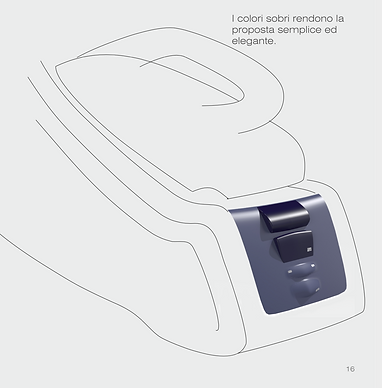
model in context
The bigger buttons are made more discreet by the darker colour. The two bottom buttons have a different texture finish.
The overall proposal is kept simple and elegant.
prototyping
Once the final Alias 3D model was approved, the model was sent to be prototyped with SLS (selective laser sintering).


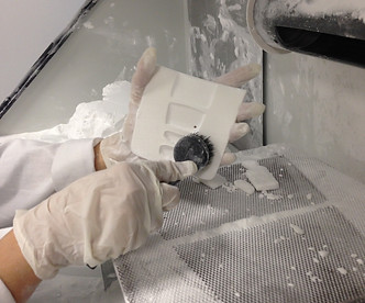

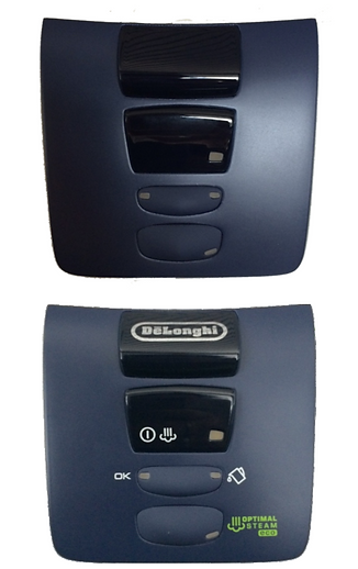
Final outcome
The prototype was cleaned, painted and coated. The graphics linked to the various functionalities were added, obtaining a final prototype to put in context.